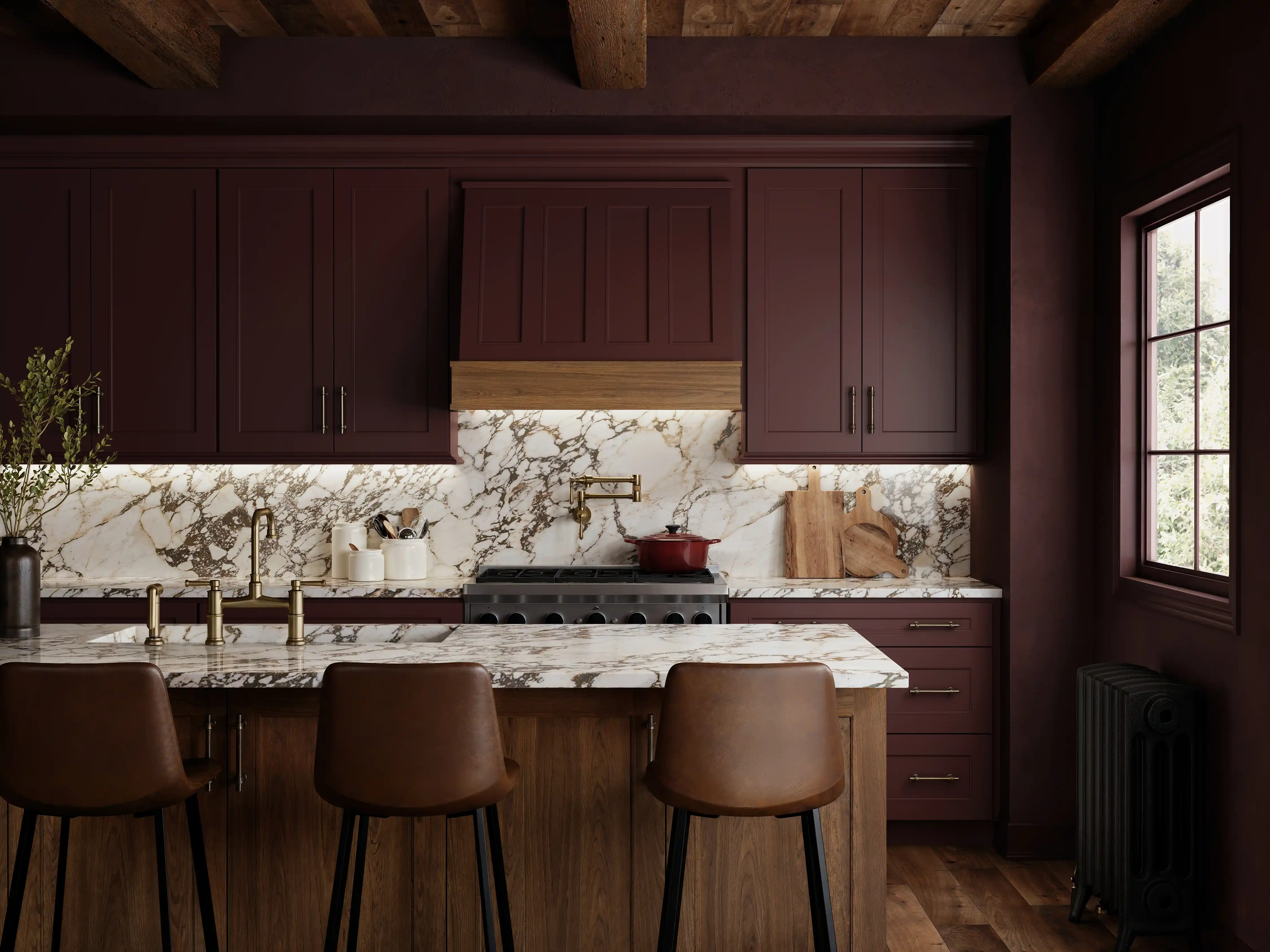
Seeing Red: The Return of a Confident Hue
There’s a new energy pulsing through interiors this season; one that’s bold, expressive, and completely unapologetic. After years of beige-on-beige restraint, red has returned, and it’s making itself at home in both subtle and sweeping waysAt High Point Market, I couldn’t walk ten feet without spotting some version of this hue: deep merlots, oxbloods, terracottas, and soft berry tones. Whether it appeared as a statement sofa or a whisper of color in a neutral vignette, red felt sophisticated, self-assured, and undeniably fresh.
The Unexpected Red Theory
A major force behind red’s resurgence came from outside the showrooms: from social media. The now-famous “Unexpected Red Theory” was coined by Brooklyn-based designer Taylor Migliazzo Simon, whose viral TikTok redefined how people see the color. Her idea is simple: any space looks more designed when it includes a touch of red.
Whether it’s a single chair, a lampshade, or a piece of art, the eye reads red as intentional; a sign of design confidence. It’s a concept that’s as accessible as it is impactful, and it’s quickly become a favorite trick among designers looking to add depth to neutral interiors.
Red has always been a high-impact color in fashion and branding, think of the soles of Louboutins, the lettering of Coca-Cola, or Valentino’s signature gowns. The “Unexpected Red Theory” simply translated that same visual authority into interiors, and now we’re seeing the ripple effect across the design world.
A Color We’ve Loved (and Feared) Before
This isn’t red’s first moment in the spotlight. Anyone who lived through the early 2000s Tuscan era remembers when every dining room was painted red. It was the color of the moment: rich, romantic, and paired with golden walls and heavy wood furniture.But like many trends, it eventually burned too bright. As cool neutrals took over the 2010s, red became the symbol of a dated design era, something to be painted over, not celebrated. Now, two decades later, red has returned, but with restraint, texture, and sophistication.Today’s reds are softer, more layered, and paired with organic materials: clay tones, merlot velvets, burgundy stains, and berry-tinted fabrics.Instead of commanding the room, they belong to it.
From Pop to Presence
At Market, red wasn’t just a pop, it was a presence. Entire vignettes showcased the power of tone-on-tone warmth: plum-tinted walls, rust-hued drapery, and merlot sofas grounded by caramel, cream, and light oak finishes.
Why Red Resonates Again
After years of calm, cool minimalism, people are craving warmth, vitality, and connection, and few colors embody that like red. Psychologically, it’s the color of energy and passion; in design, it sparks emotion and makes a room feel human. The new wave of red isn’t nostalgic, it’s emotional. It reflects where we are culturally: ready to feel again, ready to take risks again, ready to make our homes expressions of personality instead of perfection.
Final Thoughts
Whether it’s a whole room wrapped in merlot or a single pop of crimson on a neutral backdrop, red reminds us that great design doesn’t whisper, it speaks. So go ahead. Add that red lamp, the terracotta vase, or the oxblood cabinetry. You might just find that it’s the unexpected touch your space was missing.
Cerisse Wilson